Close
Window
Last Updated:
25 January 05

 |
Section
1: An Introduction to ChartDog 2.0 |
 ChartDog
is a web-based application that allows you to create progress-monitoring graphs.
The application follows common conventions for graphing single-subject research
data (Hayes, 1981; Kazdin, 1982). With ChartDog, you can:
ChartDog
is a web-based application that allows you to create progress-monitoring graphs.
The application follows common conventions for graphing single-subject research
data (Hayes, 1981; Kazdin, 1982). With ChartDog, you can:
-
enter up to two
sets of data to be graphed.
-
group data series
into discrete phases on the time-series graph.
-
attach custom
labels to each graph phase.
-
create customized
labels for the X- and Y-axes (as well as a customized title for the chart).
-
compute trend
(regression) lines, means, and percentage of non-overlapping data-points
for each data phase.
ChartDog is a useful
tool for charting and analyzing outcome data to judge whether a student has
made significant improvements in academic or behavioral goals in response
to classroom interventions.
 |
Section
2: Getting Started With ChartDog 2.0 |
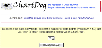
When you first open
ChartDog 2.0, a 'starter' page wil be displayed (see figure below). The page
directs you to select from a drop-down list the number of data points that
you want to enter into the application and to click the 'Open ChartDog!'
button. Immediately, the page reloads in a format that allows you to enter
data to be charted.
|
| ChartDog
2.0: Starter Page |
|
|
|
Don't worry if you
are not sure how many observations that you will ultimately chart: ChartDog
allows you to add additional lines for data entry at any time
 |
Section
3: Customizing ChartDog 2.0 Graphs |
ChartDog gives you
the ability to customize your data graph to suit your own needs. You can change
the following chart settings:
-
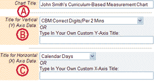
Chart
Title. You can type in a custom title for your graph (Figure 1A). Chart
titles can be up to 50 characters in length.
|
| Figure
1: Enter Graph,
X-Axis,
and Y-Axis Names |
|
|
|
|
|
| Figure
2: Select Line-Plot Options |
|
|
|
|
-
Y-axis
Title. When creating a label for the Y (vertical) axis of your chart
(Figure 1B), you can choose from a preformatted drop-list of Curriculum-Based
Measurement choices (e.g., 'CBM Correct Digits/Per 2 Mins'). Or you can
enter your own custom label (up to 50 characters). If you should type in
a custom label and select a choice from the drop-list, ChartDog will
accept your custom label to display on the graph.
-
X-axis
Title. The X (horizontal) axis displays on the chart the dates when
time-series data were collected. When creating a label for the X axis (Figure
1C), you can choose from a preformatted drop-list of choices (e.g., 'Calendar
Days'). Or you can enter your own custom label (up to 50 characters). If
you should type in a custom label and select a choice from the drop-list,
ChartDog will accept your custom label to display on the graph.
-
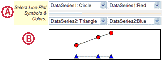
Line-Plot
Options. ChartDog allows you to choose the specific appearance of the
line-plots. For each data-series, you can select from drop-lists to determine
the shape (e.g., circle, diamond, triangle) and color (e.g., red, blue,
green) for line-plot elements. Figure 2A shows the drop-lists that appear
on the ChartDog web form. Figure 2B displays the line-plots that appear
on the graph, as dictated by the user's selection.
|
| Figure
3: Show Numeric Values of Data-Points |
|
|
|
|
|
| Figure
4: Select Optional 'Short
Names' For Data-Series |
|
|
|
|
-
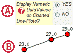
Show
Data Values. For each line-plot, you can choose to show or hide the
numeric value of the data-points. (Displaying values as numbers on the graph
can help users to better grasp the data.) Figure 3A illustrates the button
on the ChartDog form that allows you to display numeric data values. Figure
3B provides a visual example of a line-plot that includes data values.
-
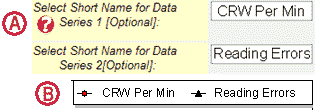
Short
Names for Data-Series. If you want to assign unique labels to your data
series, you can type those labels into the ChartDog web form (Figure 4A).
Each label can be up to 25 characters in length. Labels that you enter will
appear in the graph legend (see example in Figure 4B). If you do not name
your data series, ChartDog will assign generic names to them (e.g., "Data
Series 1").
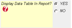
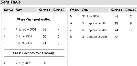
- Display
Data Table in Report? You have the option to have a table of data values
appear in your generated chart report, to be displayed beneath the time-series
chart. (Figure 5A shows how the user selects or deselects the 'Display Data
Table' option, while Figure 5B presents a sample Data Table as it would appear
in your chart report.)
|
| Figure
5A: Display Data Table in Report |
|
|
|
|
|
| Figure
5B: Example of Chart Data Table |
|
|
|
|
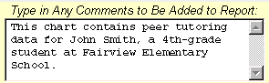
- Type
in Comments for Report. If you comments of your own into the box 'Type
in Any Comments to Be Added to Report' (See Figure 6), that text will
also be displayed in the final chart report.
|
| Figure
6: Type Comments to Be Added to Report |
|
|
|
|
 |
Section
4: Entering Dates & Data into ChartDog 2.0 |
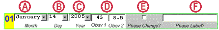
For each observation
date, you can enter up to two separate data values into ChartDog and select
the date on which the observation(s) were collected. ChartDog also allows
you to mark multiple phase changes on the data chart and to add custom phase
labels.
-
Entering
Dates of Observations. For each data point that you enter into ChartDog,
you must also enter a corresponding date on which that data value was collected.
The ChartDog web form contains drop-down lists with month, day, and year
(see Figures 7A, B, & C, respectively). Use these lists to select the
date of the observation.
Entering
Dates: Time-Saving Tip!! ChartDog has a great time-saving feature
for entering date information. When you select a month or year (for example,
on Observation #1), ChartDog 'remembers' that each of these date-values
has been selected. As you enter additional observations, if the month remains
unchanged from previous data points, you do not need to select the month
again. The year-value, too, does not need to be reselected for later
data values if it remains unchanged. Only a new day-value must be selected
for each observation.
|
| Figure
7: Enter Dates & Data Values
For Each Observation |
|
|
|
|
|
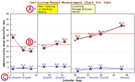
| Figure
8: Example of Labeled Graph |
|
|
|
|
-
Entering
Numeric Data. Type each data observation into the appropriate box (Figure
7D). ChartDog will accept only numeric values as valid data. The application
can handle integer and decimal values, as well as negative numbers. If you
are entering values for two data series, type the number value for the first
data series into the box 'Obsv 1' and type the number value for the second
data series into the box 'Obsv 2'. (See Figure 7D for an example of how
to format the entry of two values). When you enter observations for two
data series, ChartDog will plot these series as separate line-plots (as
shown on the sample graph in Figure 8).
-
Marking
Phase Changes . In ChartDog, you can mark significant 'phase changes'
on the graph by clicking the 'Phase Change?' box. (See Figure 7E for an
illustration of the 'Phase Change?' checkbox.) Phase changes are locations
in a data series in which a significant modification has taken place in
the conditions of the program or treatment being measured--e.g., a major
alteration of a student's academic program. When you select a phase change
for a specific observation date, ChartDog inserts a break into the charted
line-plot(s) and places a vertical dividing line on the graph to mark
the phase change. (Refer to Figure 8B for an example of a charted phase
change).
-
Inserting
Phase Labels . You have the option to label phase changes on your graph.
Just type the content of the phase-label into the 'Phase Label?" box
(Figure 7F), which will accept up to 40 characters. Your phase labels will
appear as tabs on top of the time-series chart (see phase-label example
in Figure 8A).
-
Create Chart.
Once you have entered all of your data and chart settings, you create
a chart simply by clicking on the 'Create Chart!' button that appears
at both the start and end of Section 3: Enter Data Observations (Figure
9A). The progress-monitoring chart will appear in a separate window. See
Figure 12 below for an example of a progress-monitoring chart created by
ChartDog.
-
Erase
Chart Data & Settings. If you wish to erase all of your data and
chart settings in order to begin a fresh chart, you simply click on the
'Erase Chart Data & Settings' button' that appears at both
the start and end of Section 3: Enter Data Observations (Figure
9A). A prompt will appear asking: Are you sure that you want to erase
your chart settings and all data from this form? If you click 'OK'
to the prompt, all of your data will be erased and a new ChartDog screen
will appear
|
| Figure
9A: Create Chart/Erase Chart Data & Settings |
|

|
|
|
-
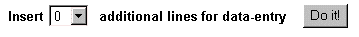
Adding
More Lines for Data Entry. If you have run out of lines in which to
enter observation dates and data, you can add up to 10 additional 'lines'at
a time. (See Figure 9B.) Using the drop-down list that appears at the bottom
of the ChartDog web page, select anywhere from 1 to 10 lines to add to the
form. Then click the button 'Do it!'. The ChartDog page will reload
with the specified number of additional lines for data entry appearing at
the bottom of the page--and will retain your chart settings and any data
that you had previously entered.
|
| Figure
9B: Add Data Lines |
|
|
|
|
 |
Section
5: Saving Data & Chart Settings in ChartDog 2.0 |
ChartDog 2.0 now allows you to save your chart settings and any data that
you have entered into the program. You must complete two steps to permanently
save data in ChartDog:
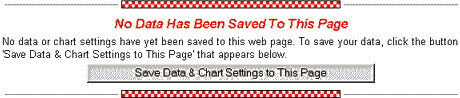
STEP 1: SAVE DATA TO THE WEB PAGE:
If no data have yet been saved to the page, you will see a red checked border
displayed, along with the message 'No Data Has
Been Saved to This Page'(Figure 10A).
To save data, you enter the data
you wish to have appear in the chart and customize any chart settings that
you wish to save. Then you click the 'Save Data & Chart Settings to
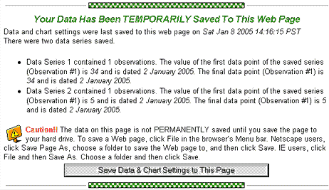
This Page' button. The page will reload. A green checked border will be
displayed, along with the message 'Your Data Has
Been TEMPORARILY Saved to This Web Page' (Figure 10B).
|
| Figure
10A: 'No Data Saved to Page' Message |
|
|
|
|
|
| Figure
10B: 'Data Temporarily Saved to Page' Message |
|
|
|
|
STEP 2: SAVE DATA TO YOUR HARD
DRIVE. Please note that your data is not PERMANENTLY saved until you save
the page to your hard drive. To save a Web page, click File in the browser's
Menu bar. Netscape users, click Save Page As, choose a folder to save the
Web page to, and then click Save. IE users, click File and then Save As. Choose
a folder and then click Save.
Once you have successfully saved
a ChartDog web page with data to your hard drive, you can open that page weeks
or months later and all of the data will appear on the page just as you left
it. If your computer is connected to the Internet when you open the saved
ChartDog page, you can immediately create a chart or add more data and resave
the page to the hard drive.
 |
Section
6: ChartDog 2.0 Data Analysis Options |
You are most likely to use
ChartDog to measure the impact of an intervention, or 'treatment', on a single
subject (e.g., a student) over time. If that treatment results in immediate
improvements, you may be able to tell just by looking at the pattern of data
points on your graph that your intervention has proven highly effective. However,
on many time-series graphs, it is typical for the data to vary considerably
from day to day. When faced with so much 'scatter' or variability in the data
points on your chart, you may find it difficult to pick out any strong underlying
pattern or trend through visual inspection alone. ChartDog gives you several
computational and statistical tools that you can use to help you to analyze
and draw conclusions from your charted data.
|
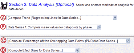
| Figure
11: Choose One or More Methods of Data Analysis for Each
Data-Series |
|
|
|
|
By selecting data-analysis
tools from the ChartDog drop-list (Figure 11), you can:
-
compute a least-squares
regression (trend) line for a data series (Figure 11A)
-
calculate the
mean value for each phase on your data chart (Figure 11B)
-
compile the percentage
of non-overlapping data points by phase (Figure 11C)
-
compute an effect
size for any treatment phase when compared to a baseline phase (Figure
11D).
|
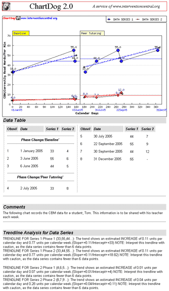
| Figure
12: Example of a ChartDog Time-Series Chart Report |
|
|
|
|
You can choose to use any or all
of these tools to analyze data from a particular graph. The results of each
analysis appear on the chart report, below the time-series graph (see sample
chart above in Figure 12). Each data-analysis tool has its own strengths and
limitations--as described below:
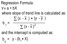
'Compute
Trend (Regression) Lines for Data Series...' When drawn on a graph,
trend lines summarize the direction and rate of change in a data series
(Franklin, Gorman, Beasley, & Alison, 1996). ChartDog calculates trend
by using ordinary least-squares (OLS) regression (Moore & McCabe, 1989),
a statistical formula that is widely used in time-series graphs (Franklin,
Gorman, Beasley, & Alison, 1996), including those used for curriculum-based
measurement monitoring (Shinn, Good, & Stein, 1989). As shown in Figure
12, the computation of OLS regression results in slope and intercept
values. Using these values, ChartDog draws a dotted-line through the data
series that shows the best 'linear fit' of all values (see example in Figure
14A).
| |
|
| Figure
13: Formula for Computing Least-Squares Regression |
|
|
|
|
| Figure
14: Chart Examples of Regression Analysis (A) and Mean Value
(B) |
|
|
|
|
You can view the
trend line to get a visual estimate of the direction and rate of improvement
for the individual whose data are being graphed. Slope and intercept
values also appear in the 'Graph Notes' window.
Cautions and Limitations
in Interpreting OLS Regression:
-
While OLS regression
is a useful tool for data analysis, you should place less confidence in
its results if your data are highly variable (Moore & McCabe, 1989).
When graphing Curriculum-Based Measurement data, for example, educators
often discover a great deal of variability in a student's data over time.
In such cases, OLS regression loses some of its predictive power. If faced
with this situation, educators should consider supplementing the use of
a trend line with visual inspection or other techniques to help them to
judge the rate of student improvement (Dunn & Eckert, 2002).
-
Keep in mind that
the accuracy of the least-squares regression formula diminishes with fewer
data points. For this reason, ChartDog will not compute a trend-line for
any data series containing fewer than 5 data points.
'Compute
Means for Data Series...' For each phase in your graph, ChartDog
can compute the mean value of data points present within that phase. When
you select this option, you see that mean values are represented on your
graph as horizontal lines within each phase (see Figure 14B for an example).
Means for each data series are drawn in the same color that you select for
that data series (e.g., green, red, blue). Mean values also appear in the
'Graph Notes' window.
Cautions and
Limitations in Interpreting Phase Means:
-
The mean values
of data series are useful, but do have limitations. Specifically, they
provide no information about either the variability of data in the series
or the trend (rate of change) occurring within that data series.
-
Because means
for each data series represent the average of all data points, they
can be skewed (distorted) by extreme (high or low) outlier values in
that series
'Compute
Percentage of Non-Overlapping Data Points (PNDs) for Data Series...' One
method for quantifying the impact of a treatment or intervention phase in
a data series is to calculate the percentage of non-overlapping data points
(PNDs) in the treatment phase when compared to the baseline phase (Faith,
Allison, & Gorman, 1996); Scruggs, Mastropieri, & Casto, 1987).
PNDs are computed in four steps:
- Decide whether the target behavior
that you are measuring is intended to increase or to decrease during the treatment
phase.
- Count up the number of data points
in the treatment phase that do not overlap the data points in the baseline
phase.
- If you intend for your target
behavior to INCREASE, you count only those treatment data points that
are HIGHER than the highest point in the baseline data series.
- If you intend for your target
behavior to DECREASE, you count only those treatment data points that
fall BELOW the lowest point in the baseline data series.
- Divide the number of non-overlapping
data points in the treatment series by the TOTAL number of data points in
the treatment series.
- Multiply the figure from step
3 by 100.
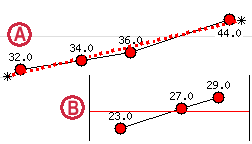
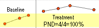
A brief example
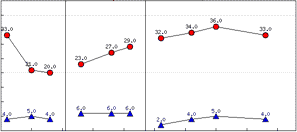
will illustrate the calculation of PNDs. Figure 15 shows a series of
4 data points (treatment phase) being compared to a series of 3 data
points (baseline phase). Higher data points represent the desired direction
for improvement in this data series (Step 1). There are 4 data points
in the treatment phase that do not overlap baseline data (Step 2).
|
| Figure
15: Example of PND Calculation |
|
|
|
We find that
there are also a total of four data points in the entire treatment series.
When we divide 4 non-overlapping data points by the total of 4 values
in the series, we get a quotient of 1.0 (Step 3). We then multiply this
quotient by 100 to find that the PND for the treatment phase is 100%.
ChartDog displays PND values in the 'Graph Notes' window.
Cautions and
Limitations in Interpreting PNDs:
-
A high degree
of variability in baseline data may reduce the PND value of a treatment
phase that follows. Extreme outlier values in baseline data may overlap
a large percentage of the treatment phase data points, even if overall
the treatment phase appears highly successful (Faith, Allison, &
Gorman, 1996).
-
If you are
running a single-subject reversal design, you are likely to find an
'extinction effect' when you move from a treatment phase to the second
baseline phase. It is expected under these conditions that the subject's
behaviors will change from treatment levels to baseline levels quite
quickly with the withdrawal of the treatment. Because this accelerating
or decelerating 'extinction pattern' is likely to span a large range
of data values before it returns to baseline levels, any new treatment
phase that immediately follows is unlikely to have a high PND value--even
if the treatment appears upon visual inspection to have been successful
(Scruggs, Mastropieri, & Casto, 1987).
| |
 |
|
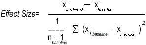
'Compute
Effect Sizes for Data Series...' Advanced users of ChartDog may
wish to calculate a standardized 'effect size' for treatment data collected
on an individual subject. By calculating effect sizes for each subject in
a multi-participant study, a researcher can then report the mean of those
values as the 'average' effect size, or outcome, of the study. Or ChartDog
users may want to convert the findings of a single-subject study to an effect-size
so that they can compare their results to published studies of a similar
nature.
While a number of
formulas exist for calculating effect sizes in single-subject designs, ChartDog
employs a commonly used 'standardized difference approach' (Faith, Allison,
& Gorman, 1996; Shernoff, Kratochwill, & Stoiber, 2002). Using this
formula (Figure 16):
|
| Figure
16: Formula for Computing Effect Size Between Treatment and
Baseline
Phases (Faith, Allison, & Gorman, 1996) |
|
|
|
When you prompt
ChartDog to calculate effect sizes, the program begins with the second
phase and cycles through all phases appearing in the chart. Treating
the current phase as the 'treatment' phase and the phase preceding
the current phase as the 'baseline' phase, ChartDog successively calculates
an effect size for each treatment phase. Effect-size values appear in
decimal format and are displayed in the 'Graph Notes' window.
Cautions and
Limitations in Interpreting Effect Sizes (Faith, Allison, &
Gorman, 1996):
-
Effect sizes
do not provide information about slope (or rate of change) in the treatment
data series.
-
Single-subject
time-series data may contain positive or negative autocorrelation--which
can bias effect-size values.
 |
Section
7: About ChartDog 2.0 |
ChartDog is a web-based program that constructs customized progress-monitoring
time-series graphs from data-values entered by the user. It is programmed
in PHP, an Internet [computer] scripting language. ChartDog is built upon
the foundation of JPGraph, a freeware suite of PHP code that creates dynamic
charts for the Internet. JPGraph was created by Johan Persson, a Swedish programmer
who has demonstrated great generosity in making his software available at
no cost to web developers. Learn more about JPGraph at: http://www.aditus.nu/jpgraph.
The dog
icons used throughout the ChartDog web form and manual came from Nory
Island, a Japanese web site with neat graphics.
used throughout the ChartDog web form and manual came from Nory
Island, a Japanese web site with neat graphics.
I (Jim Wright) would also like to express my appreciation to some folks
who helped me to create or improve ChartDog, including:
-
Dr. Joe Sliker,
a school psychologist with Milwaukee Public Schools. Joe was kind enough
to give me a tutorial in using JPGraph when I was there in February 2003
presenting workshops to Milwaukee Public Schools staff. Without Joe's
strategic assistance, ChartDog would never have been created!
-
Kari Sassu.
As a doctoral school psychology student at the University of Connecticut,
Kari diligently emailed me at several points in 2004 to alert me to bugs
in the original version of ChartDog--which I was then able to fix.
-
School psychologist
Dr. Seth Aldrich, who gave me detailed feedback on an earlier version
of ChartDog and was invaluable in helping me to select features to include
in this upgrade. Seth is a friend and colleague (and my neighbor!) who
offered lots of valuable recommendations,including the suggestions that
ChartDog allow the user to plot trendlines for every phase of data appearing
in a time-series chart and that the user be able to permanently save data
in ChartDog. Both of those recommendations were incorporated into ChartDog
2.0.
| |
|
|
References
Dunn, E.K. &
Eckert, T.L. (2002). Curriculum-based measurement in reading: A comparison
of similar versus challenging material. School Psychology Quarterly,
17, 24-46.
Faith,M.S., Allison,
D.B., & Gorman, B.S.(1996). Meta-analysis of single-case research. In
R.D.Franklin, D.B.Allison, & B.S.Gorman (Eds.), Design and analysis
of single-case research. (pp.245-277). Mahwah, NJ: Lawrence Erlbaum Associates.
Franklin,R.D., Gorman,
B.S., Beasley, T.M., & Allison, D.B. (1996). Graphical display and visual
analysis. In R.D.Franklin, D.B.Allison, & B.S.Gorman (Eds.), Design
and analysis of single-case research. (pp.119-158). Mahwah, NJ: Lawrence
Erlbaum Associates
Hayes, S.C. (1981).
Single case experimental design and empirical clinical practice. Journal
of Consulting and Clinical Psychology, 49, 193-211.
Kazdin, A.E. (1982). Single-case research designs: Methods for clinical
and applied settings. New York: Oxford Press.
Moore, D.S., & McCabe, G.P. (1989). Introduction to the practice of
statistics. New York: W.H. Freeman and Company.
Scruggs, T.E., Mastropieri, M.A., & Casto, G. (1987). The quantitative
synthesis of single-subject research: Methodology and validation. Remedial
and Special Education, 8(2), 24-33.
Shernoff, E.S., Kratochwill, T.R., & Stoiber, K.C. (2002). Evidence-based
interventions in school psychology: An illustration of task force coding criteria
using single-participant research design. School Psychology Quarterly,
17, 390-422.
Shinn, M.R., Good, R.H., &
Stein, S. (1989). Summarizing trends in student achievement: A comparison
of methods. School Psychology Review, 18, 356-370.
Close
Window